ShopDreamUp AI ArtDreamUp
![Grab of death [Commission]](https://images-wixmp-ed30a86b8c4ca887773594c2.wixmp.com/f/78a1918a-f94e-45b2-82aa-cc8d9d5d0e13/d699tc3-a3818671-bd5a-4b72-a49e-481eed25e4a5.png/v1/fill/w_1280,h_862,q_80,strp/grab_of_death__commission__by_wingedwilly_d699tc3-fullview.jpg?token=eyJ0eXAiOiJKV1QiLCJhbGciOiJIUzI1NiJ9.eyJzdWIiOiJ1cm46YXBwOjdlMGQxODg5ODIyNjQzNzNhNWYwZDQxNWVhMGQyNmUwIiwiaXNzIjoidXJuOmFwcDo3ZTBkMTg4OTgyMjY0MzczYTVmMGQ0MTVlYTBkMjZlMCIsIm9iaiI6W1t7ImhlaWdodCI6Ijw9ODYyIiwicGF0aCI6IlwvZlwvNzhhMTkxOGEtZjk0ZS00NWIyLTgyYWEtY2M4ZDlkNWQwZTEzXC9kNjk5dGMzLWEzODE4NjcxLWJkNWEtNGI3Mi1hNDllLTQ4MWVlZDI1ZTRhNS5wbmciLCJ3aWR0aCI6Ijw9MTI4MCJ9XV0sImF1ZCI6WyJ1cm46c2VydmljZTppbWFnZS5vcGVyYXRpb25zIl19.Z7w-DSS3WC6Y_ZzQ_3mkCS61cpWofXm0qGUjQx8WmDE)
Deviation Actions

![You're one of us now [Commission]](https://images-wixmp-ed30a86b8c4ca887773594c2.wixmp.com/f/78a1918a-f94e-45b2-82aa-cc8d9d5d0e13/d619l9z-f13a3cf2-3623-4441-9af8-606b0d82d9b0.png/v1/crop/w_92,h_92,x_9,y_0,scl_0.053240740740741,q_70,strp/you_re_one_of_us_now__commission__by_wingedwilly_d619l9z-92s.jpg?token=eyJ0eXAiOiJKV1QiLCJhbGciOiJIUzI1NiJ9.eyJzdWIiOiJ1cm46YXBwOjdlMGQxODg5ODIyNjQzNzNhNWYwZDQxNWVhMGQyNmUwIiwiaXNzIjoidXJuOmFwcDo3ZTBkMTg4OTgyMjY0MzczYTVmMGQ0MTVlYTBkMjZlMCIsIm9iaiI6W1t7ImhlaWdodCI6Ijw9OTMzIiwicGF0aCI6IlwvZlwvNzhhMTkxOGEtZjk0ZS00NWIyLTgyYWEtY2M4ZDlkNWQwZTEzXC9kNjE5bDl6LWYxM2EzY2YyLTM2MjMtNDQ0MS05YWY4LTYwNmIwZDgyZDliMC5wbmciLCJ3aWR0aCI6Ijw9MTI4MCJ9XV0sImF1ZCI6WyJ1cm46c2VydmljZTppbWFnZS5vcGVyYXRpb25zIl19.WTg4E8ccMEIXVd1brMayBqOXXl9u2l9fFTYV7LF5i44)


![Calm Robyn JD [Commission]](https://images-wixmp-ed30a86b8c4ca887773594c2.wixmp.com/f/78a1918a-f94e-45b2-82aa-cc8d9d5d0e13/d5r1il5-c532292b-8195-45f9-a9b4-cd83fe095105.gif/v1/crop/w_92,h_92,x_0,y_0,scl_0.20720720720721/calm_robyn_jd__commission__by_wingedwilly_d5r1il5-92s.png?token=eyJ0eXAiOiJKV1QiLCJhbGciOiJIUzI1NiJ9.eyJzdWIiOiJ1cm46YXBwOjdlMGQxODg5ODIyNjQzNzNhNWYwZDQxNWVhMGQyNmUwIiwiaXNzIjoidXJuOmFwcDo3ZTBkMTg4OTgyMjY0MzczYTVmMGQ0MTVlYTBkMjZlMCIsIm9iaiI6W1t7ImhlaWdodCI6Ijw9NDQ4IiwicGF0aCI6IlwvZlwvNzhhMTkxOGEtZjk0ZS00NWIyLTgyYWEtY2M4ZDlkNWQwZTEzXC9kNXIxaWw1LWM1MzIyOTJiLTgxOTUtNDVmOS1hOWI0LWNkODNmZTA5NTEwNS5naWYiLCJ3aWR0aCI6Ijw9NDQ0In1dXSwiYXVkIjpbInVybjpzZXJ2aWNlOmltYWdlLm9wZXJhdGlvbnMiXX0.CSfyEXhVo0TIt_SMcmjk4GooZ5CfQ4l_L3hfFwdMSKk)


Suggested Deviants


Suggested Collections


You Might Like…


Featured in Groups


Description
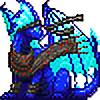
Long-waited commission for the loyal 
I couldn't make it while I was on exams and in trip,but it came out only better when I started drawing it after trip where I visited
Gamesworkshop and saw a lot of Necron figurines. Kinda boosted me for that drawing I promised you.
I really like how black/evil/corruption clouds came out here.
And monolith I just like its light here.
First drawn things:
+Double coloring of lineart (with shadow/light technique)
+Detailed wires in robotic claw and arm
+Highlighted circling clouds.
+Claws ._. (Actually few times year ago but it all were fails)
+My personal revolution on new technique of drawing roaring dragons
(I finally got into how to draw their mouth open wide in roar)
I really like how this one came out. ^^
Thanks for the commission,~BloodDragonJL.I got a lot of pleasure doing it this time. (Wink)")
Krysta (c) belongs to
Art (c) belongs to me.


I couldn't make it while I was on exams and in trip,but it came out only better when I started drawing it after trip where I visited
Gamesworkshop and saw a lot of Necron figurines. Kinda boosted me for that drawing I promised you.
I really like how black/evil/corruption clouds came out here.
And monolith I just like its light here.
First drawn things:
+Double coloring of lineart (with shadow/light technique)
+Detailed wires in robotic claw and arm
+Highlighted circling clouds.
+Claws ._. (Actually few times year ago but it all were fails)
+My personal revolution on new technique of drawing roaring dragons
(I finally got into how to draw their mouth open wide in roar)
I really like how this one came out. ^^
Thanks for the commission,~BloodDragonJL.I got a lot of pleasure doing it this time.
Krysta (c) belongs to
Art (c) belongs to me.
Image size
2209x1487px 1.19 MB
Comments97
Join the community to add your comment. Already a deviant? Log In
This'll be my first critigue, but I'll try to be as helpful as possible. <img src="e.deviantart.net/emoticons/s/s…" width="15" height="15" alt="
- Vision: I can see what you're going for in this, and I like it! The character's blue colors are nice and don't clash, plus that nifty gadget she's using looks great! However, your anatomy can use more work-- such as the proportion of the head (The horns look big for the slightly small head/neck, and the lower jaw almost disappears).
- Originality: I don't see a work like this often, with a character as the focus, showing off their attack and general ferocity, but I've seen it before. (But that detachable claw weapon is badass.)
- Tech: Your coloring, of all things, is pleasing to my eyes. I love how the lighting is very much coming from a constant source, and the shadows aren't pure blacks and ugh.
- Impact: POW! The bright colors make my eyes focus on your work, but the green takes away from the character slightly. There are two toxic looking greens on top and on the bottom of the character, kinda makes me look everywhere instead of at your character, which is obviously the focus of this piece.
In short, I actually really like this piece, but feel it could use improvement-- which we all could use, actually! I hope this helps, man. <img src="e.deviantart.net/emoticons/s/s…" width="15" height="15" alt="